Insurance Infographics

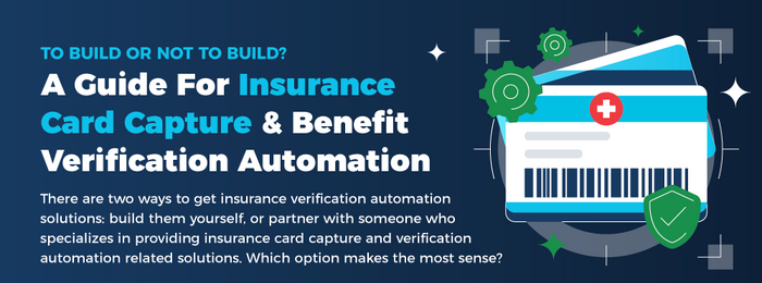
Here is a good-looking infographic produced by the website called Orbit Healthcare that offers lots of information about insurance verification automation solutions and will help you to choose between building one yourself or partnering up with someone who specialises in providing it. The design is broken down into sections including...

Here is a useful infographic produced by the website called Orbit Healthcare that offers information about how to capture, verify, and process insurance with an AI-powered solution. This quality design will teach you about the challenges of traditional insurance processing, the orbit AI-powered insurance card reader processes and the benefits...

Here is a helpful infographic from the empowering healthcare providers called Orbit Healthcare which features information about the benefits of insurance capture and verification automation. Check out this piece to learn about why manual insurance intake and verification is inefficient and error prone, the real price of unverified insurance and...

Here is a fascinating infographic produced by the website LifeInsurance.org.uk that will teach you all about life expectancy in the United Kingdom and other parts of the World. The infographic is broken down into sections including the average life expectancy, life expectancy over 50 years, UK life expectancy vs...

Here is a good looking infographic from the life insurance discounts website Theidol.com with lots of awesome statistics about life insurance in the UK. View the average UK funeral cost, the average UK food and drink expenditure, the average UK consumer credit debt and more. infographic by Theidol.com - via Mykeymaninsurance.com...